Baseball is full of crazy trends. Some are incredibly impressive, like the New York Yankees winning five World Series championships (including four in a row) in the 1930s and six in the 1950s. Some are incredibly abysmal, like the Chicago Cubs’ 108-year drought without a World Series championship from 1908 to 2016.
In this blog, I’m going to be taking a look at four different types of trends in Major League Baseball and creating data visualizations for us to view using R-Studio. Let’s begin.
The first trend I want to take a look at is attendance history throughout the MLB, specifically the American League. To start, I’m going to load in our libraries and data.
library(dplyr)
library(ggrepel)
library(tidyverse)

avgattendance <- read_csv("~/Desktop/SPMC 350 Files/homework/data/avgattendance.csv")
attendance <- read_csv("~/Desktop/SPMC 350 Files/homework/data/alattendance.csv")
The New York Yankees and Boston Red Sox are undoubtedly the greatest rivalry in all of baseball. So let’s take a look at their rivalry in terms of fan attendance since each squad’s first season.
I’ll create two data frames for each team.
nyy <- attendance %>%
  filter(Team == "NYY")

bos <- attendance %>%
  filter(Team == "BOS")
I’m looking specifically at total season attendance numbers. Using ggplot, I’ll create a line chart visualizing just that, along with the AL average.
ggplot() +
  geom_line(data = attendance, aes(x = Year, y = SeasonTotal, group = Team), color = "light grey") +
  geom_line(data = nyy, aes(x = Year, y = SeasonTotal, group = Team), linetype = "solid", color = "#003087") +
  geom_line(data = bos, aes(x = Year, y = SeasonTotal, group = Team), linetype = "solid", color = "#BD3039") +
  geom_line(data = avgattendance, aes(x = Year, y = AvgAttendance), linetype = "dashed", color = "black") +
  geom_text(aes(x = 1920, y = 1450000), label = "NYY") +
  geom_text(aes(x = 1968, y = 2150000), label = "BOS") +
  geom_text(aes(x = 2008, y = 2100000), label = "AL Average") +
  scale_x_continuous(breaks = seq(1900,2020, by = 10)) +
  scale_y_continuous(labels = scales::comma) +
   labs(
    title = "Yankees and Red Sox attendance trends are back and forth",
    subtitle = "Wins and losses aren't the only stats NYY and BOS are competing for.",
    caption="Source: Baseball-Almanac | By Ethan Peterson",
    x = "Year",
    y = "Season Total Attendance") +
    theme_minimal() +
  theme(
    plot.title = element_text(size = 15, face = "bold"),
    axis.title = element_text(size = 9),
    plot.subtitle = element_text(size = 10),
    plot.caption = element_text(size = 6, face = "bold.italic"),
    panel.grid.minor = element_blank()
    )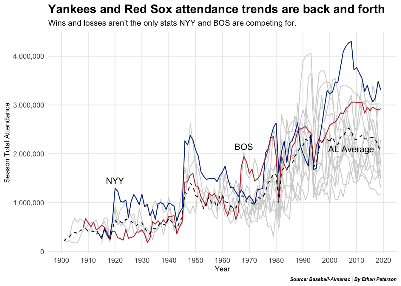
As expected, lots of up and down. The Yankees remained at or near the top in attendance almost every year. The Red Sox have a handful of years where their attendance was higher than the Yanks.
One of Boston’s low points in attendance was the late 50s and early 60s, where the team was abysmal and under performing. Contrarily, Boston saw a jump in attendance from 2003 to 2013 due to an 820-game sellout streak.
The Yankees boost in attendance in the 1920s was in part to the Babe Ruth acquisition. Overall baseball attendance seemed to drop off after 1947, when Jackie Robinson broke the color barrier, and TV viewership of baseball games surged in the 50s. The climb to peak attendance for the Yankees in the early 2000s is from the announcement of new Yankee Stadium (opening in 2009).
The next trend I’m looking at is the surge in pull-hitting, power hitters focusing on the long ball. While this has resulted in an increase in home runs, strikeouts have also jumped, too. It’s become the trend: lots of home runs = lots of strikeouts. The 2021 season was no different. I want to look at the current MVP candidates and plot their HR and SO numbers over the season. Do any stand out?
First, I need the library, baseballr. My data is unique in that it comes from that library.
library(baseballr)

data21 <- daily_batter_bref("2021-04-01", "2021-10-03")
1,006 observations is a lot. I’ll narrow it down to a smaller sample. Many hitters had little to zero at-bats and I don’t want them included.
data21 %>%
  filter(AB >= 162) -> criteria21
I chose 162 AB as my cutoff line because its a clean 1 AB per game. But that’s still too many observations. I’ll take the median AB from the new data frame I created.
summary(criteria21$AB)## Min. 1st Qu. Median Mean 3rd Qu. Max.
## 162.0 243.5 348.0 369.0 492.2 664.0criteria21 %>%
filter(AB >= 348) -> newcriteria21193 observations? Perfect. Not too many, not too little. Next, I’ll filter out my 2021 MVP candidates while also getting the mean home run and strikeout numbers for the chart.
shohei21 <- newcriteria21 %>%
  filter(Name == "Shohei Ohtani")
vladjr21 <- newcriteria21 %>%
  filter(Name == "Vladimir Guerrero Jr.")
judge21 <- newcriteria21 %>%
  filter(Name == "Aaron Judge")
semien21 <- newcriteria21 %>%
  filter(Name == "Marcus Semien")
soto21 <- newcriteria21 %>%
  filter(Name == "Juan Soto")
harper21 <- newcriteria21 %>%
  filter(Name == "Bryce Harper")
tatis21 <- newcriteria21 %>%
  filter(Name == "Fernando Tatis Jr.")
## meanSO meanHR
## 1 114.9793 20.21762Let’s see how the MVP candidates did at hitting home runs and striking out.
ggplot() +
  set.seed(1234) +
  geom_point(
    data = newcriteria21,
    aes(x = HR, y = SO),
    color="light grey",
    alpha = .5) +
  geom_vline(xintercept = 20.21762, color = "dodgerblue4", linetype = "longdash") +
  geom_hline(yintercept = 114.9793, color = "dodgerblue4", linetype = "longdash") +
  geom_point(
    data = judge21,
    aes(x = HR, y = SO),
    color="#0C2340",
    alpha = 1) +
  geom_point(
    data = shohei21,
    aes(x = HR, y = SO),
    color="#BA0021",
    alpha = 1) +
  geom_point(
    data = semien21,
    aes(x = HR, y = SO),
    color="#134A8E",
    alpha = 1) +
  geom_point(
    data = vladjr21,
    aes(x = HR, y = SO),
    color="#134A8E",
    alpha = 1) +
  geom_point(
    data = soto21,
    aes(x = HR, y = SO),
    color="#AB0003",
    alpha = 1) +
  geom_point(
    data = harper21,
    aes(x = HR, y = SO),
    color="#E81828",
    alpha = 1) +
  geom_point(
    data = tatis21,
    aes(x = HR, y = SO),
    color="#FFC425",
    alpha = 1) +
  geom_text_repel(
    data = judge21,
    aes(x = HR, y = SO, label = Name, hjust = 1.2), size = 3) +
  geom_text_repel(
    data = semien21,
    aes(x = HR, y = SO, label = Name, hjust = 1.2), size = 3) +
  geom_text_repel(
    data = soto21,
    aes(x = HR, y = SO, label = Name, hjust = 1, vjust = 0.5), size = 3) +
  geom_text_repel(
    data = vladjr21,
    aes(x = HR, y = SO, label = Name, hjust = -1.3, vjust = .4), size = 3, fontface = "bold.italic") +
  geom_text(
    data = tatis21,
    aes(x = HR, y = SO, label = Name, hjust = -0.08), size = 3) +
  geom_text_repel(
    data = harper21,
    aes(x = HR, y = SO, label = Name, hjust = 1.2), size = 3) +
  geom_text_repel(
    data = shohei21,
    aes(x = HR, y = SO, label = Name, hjust = 0.1), size = 3) +
  geom_text(aes(x = 22.2, y = 215), size = 3, label = "Avg. HR", color = "dodgerblue4") +
  geom_text(aes(x = 1, y = 110), size = 3, label = "Avg. SO", color = "dodgerblue4") +
  labs(
    title = "Do the MVP candidates stick out from the current trend?",
    subtitle = "Are any contenders following the \"high HR = high SO\" tendency or are they straying from it?",
    caption = "Source: Baseball-Reference | Graphic by Ethan Peterson",
    x = "Home runs",
    y = "Strikeouts") +
    theme_minimal() +
  theme(
    plot.title = element_text(size = 15, face = "bold"),
    axis.title = element_text(size = 8),
    plot.subtitle = element_text(size = 9),
    plot.caption = element_text(size = 6, face = "bold.italic"),
    panel.grid.minor = element_blank()
    )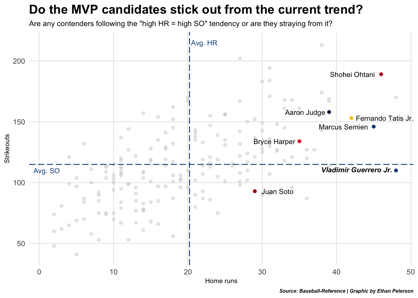
Our finalists are right where they should be. A couple of players stick out to me. Shohei Ohtani–a two-way player–recorded the second most home runs among MVP candidates, and third overall. Insanely impressive for a generational two-way talent. Vladimir Guerrero Jr., though, is the true standout. He’s tied for the most HR and is below average in strikeouts. Exactly what you want in an MVP. Oh, and he’s only 22 years old.
My third trend also involves strikeouts. Strikeouts have been on an upward climb since 2005. A good way for hitters to circumvent this is walking. How often do our candidates walk? I’ll look at their strikeout rate and their walk rate. First, I’ll mutate two new variables for SO rate and BB rate. Second, I’ll find the mean of each for an average.
newcriteria21 %>%
  mutate(
    BBrate = ((BB/PA)*100),
    Krate = ((SO/PA)*100),
  ) -> newcriteria21
## meankrate meanbbrate
## 1 21.09253 8.997398How well are our contenders at walking compared to striking out?
ggplot() +
  set.seed(3) +
  geom_point(
    data = newcriteria21,
    aes(x = BBrate, y = Krate),
    color="light grey",
    alpha = .5) +
   scale_x_continuous(limits = c(0, 25)) +
   scale_y_continuous(limits = c(0, 40)) +
  geom_vline(xintercept = 8.997398, color = "dodgerblue4", linetype = "longdash") +
  geom_hline(yintercept = 21.09253, color = "dodgerblue4", linetype = "longdash") +
  geom_point(
    data = judge21,
    aes(x = BBrate, y = Krate),
    color="#0C2340",
    alpha = 1) +
  geom_point(
    data = shohei21,
    aes(x = BBrate, y = Krate),
    color="#BA0021",
    alpha = 1) +
  geom_point(
    data = semien21,
    aes(x = BBrate, y = Krate),
    color="#134A8E",
    alpha = 1) +
  geom_point(
    data = vladjr21,
    aes(x = BBrate, y = Krate),
    color="#134A8E",
    alpha = 1) +
  geom_point(
    data = soto21,
    aes(x = BBrate, y = Krate),
    color="#AB0003",
    alpha = 1) +
  geom_point(
    data = harper21,
    aes(x = BBrate, y = Krate),
    color="#E81828",
    alpha = 1) +
  geom_point(
    data = tatis21,
    aes(x = BBrate, y = Krate),
    color="#FFC425",
    alpha = 1) +
  geom_text(
    data = judge21,
    aes(x = BBrate, y = Krate, label = Name, hjust = -0.1), size = 3) +
  geom_text(
    data = semien21,
    aes(x = BBrate, y = Krate, label = Name, hjust = -0.1), size = 3) +
  geom_text(
    data = soto21,
    aes(x = BBrate, y = Krate, label = Name, hjust = -0.1), size = 3, fontface = "bold.italic") +
  geom_text(
    data = vladjr21,
    aes(x = BBrate, y = Krate, label = Name, hjust = -0.1), size = 3) +
  geom_text(
    data = tatis21,
    aes(x = BBrate, y = Krate, label = Name, hjust = -0.05), size = 3) +
  geom_text(
    data = harper21,
    aes(x = BBrate, y = Krate, label = Name, hjust = -0.1), size = 3) +
  geom_text(
    data = shohei21,
    aes(x = BBrate, y = Krate, label = Name, hjust = -0.1), size = 3) +
  geom_text(aes(x = 10.35, y = 39), size = 3, label = "Avg. BB%", color = "dodgerblue4") +
  geom_text(aes(x = 0.14, y = 22.4), size = 3, label = "Avg. SO%", color = "dodgerblue4") +
  labs(
    title = "One candidate shines bright when comparing BB% to SO%",
    subtitle = "Strikeouts are plaguing the league, but 23-year-old Juan Soto doesn't seem fazed at all.",
    caption="Source: Baseball-Reference | Graphic by Ethan Peterson",
    x = "Walk %",
    y = "Strikeout %") +
    theme_minimal() +
  theme(
    plot.title = element_text(size = 15, face = "bold"),
    axis.title = element_text(size = 8),
    plot.subtitle = element_text(size = 9),
    plot.caption = element_text(size = 6, face = "bold.italic"),
    panel.grid.minor = element_blank()
    )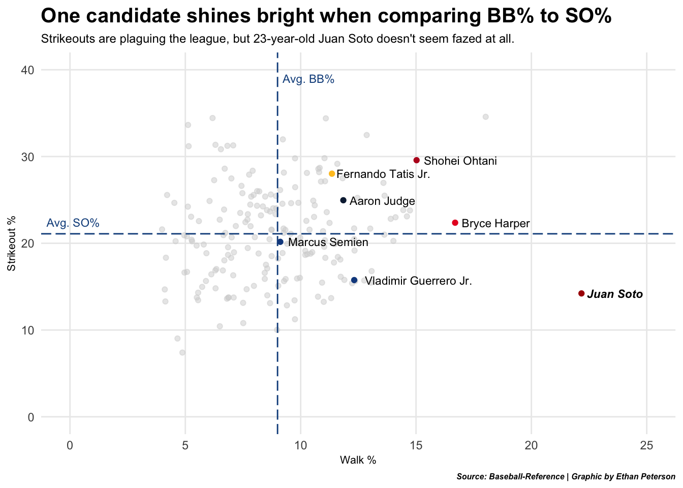
Three of our candidates have an above average walk rate and below average strikeout rate. But Juan Soto is the clear elephant in the room. He’s in his own universe. He’s the only player with a walk rate above 20%, and his strikeout rate is near the lowest in the league (among qualifiers). The craziest part is that Juan Soto was only 22 years old. A 22-year-old having this much plate discipline is extremely rare. There’s a reason he’s in the MVP race.
Lastly, I want to look at the 2019 Cy Young winners, Justin Verlander (HOU) and Jacob deGrom (NYM). I’m particularly interested in looking at success in limiting extra base hits. What proportion of their hits were extra base hits compared to singles?
I’ll load in our data with baseballr.
pitchdata19 <- daily_pitcher_bref("2019-03-28", "2019-09-29")I’ll use a waffle chart. To do that, we need to use waffle.
library(waffle)Waffle charts like vectors. It’s all about a proportion of the whole. I’m going to look at each players’ four-hit outcomes in the 2019 season. I need to tally up their total hits by hit type.
JustinVerlander <- c("HR" = 36, "3B" = 7, "2B" = 28, "1B" = 66, 17)
JacobdeGrom <- c("HR" = 19, "3B" = 1, "2B" = 28, "1B" = 106)
What proportion of the hits allowed by the 2019 Cy Young winners were extra base hits?
iron(
waffle(
        JustinVerlander,
        rows = 6,
        colors = c("#FF6D6A", "#77DD77", "#F7DA63", "#8BD3E6", "white")) +
   labs(
     title = "Which Cy Young winner gave up bigger hits?",
     subtitle="Interestingly, each pitcher gave up 28 doubles. But the variation between HR and 1B is alluring.") +
   theme(
    plot.title = element_text(size = 16, face = "bold"),
    plot.subtitle = element_text(size = 10),
  ),
waffle(
        JacobdeGrom,
        rows = 6,
        title = "(NL, below) Jacob deGrom's hits allowed | (AL, above) Justin Verlander's hits allowed",
        xlab = "1 square = hit allowed",
        colors = c("#FF6D6A", "#77DD77", "#F7DA63", "#8BD3E6")) +
  labs(
    caption = "Source: Baseball-Reference | Graphic by Ethan Peterson") +
  theme(
    plot.title = element_text(size = 10, face = "bold"),
    axis.title.x = element_text(size = 8),
    axis.title.y = element_blank(),
    plot.caption = element_text(size = 8, face = "bold.italic"))
)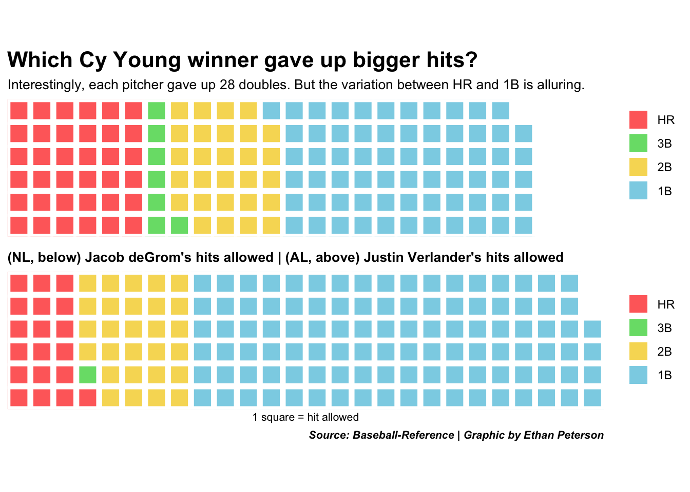
Off the bat (pun intended), I notice deGrom allowed plenty more singles (106 to 66). But Verlander surrendered 36 home runs (28 of them being solo HR) and deGrom only conceded 19. Both pitchers logged 200+ IP, and they coincidentally both allowed the same number of doubles (28).
Verlander led the league with 223 IP; deGrom was close behind with 204. But deGrom gave up 17 more hits than Verlander. Looking back at the data frame used, I cycled through the different statistics. Both of these pitchers were elite. Verlander’s ERA was only 2.58 and deGrom’s was a dominant 2.43. In terms of ERA, those extra 17 home runs that Verlander allowed proved to be costly.
Baseball and it’s trends are fascinating. Finding these trends and being able to find interesting stories inside of them was incredibly enjoyable. Baseball won’t ever go away, and nor will their unique and impressive trends.